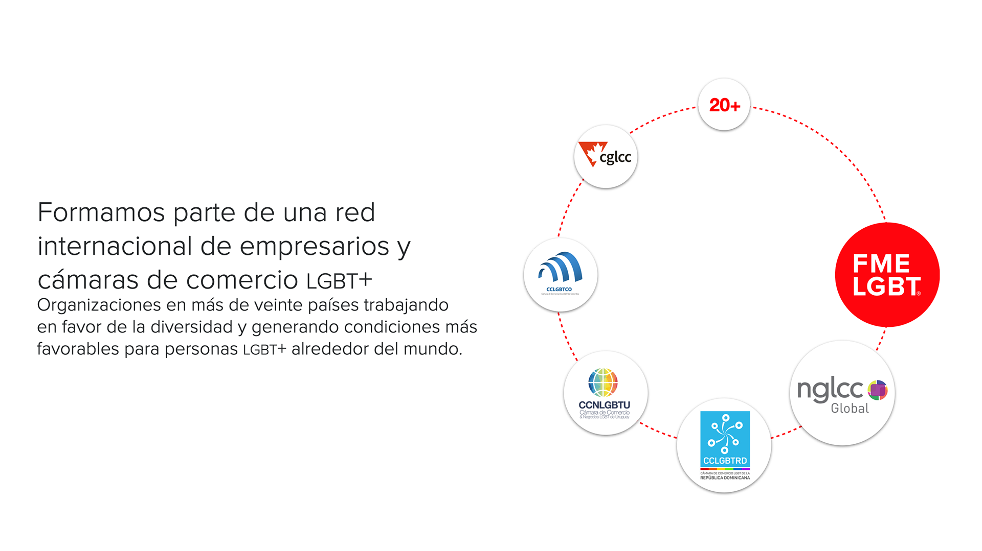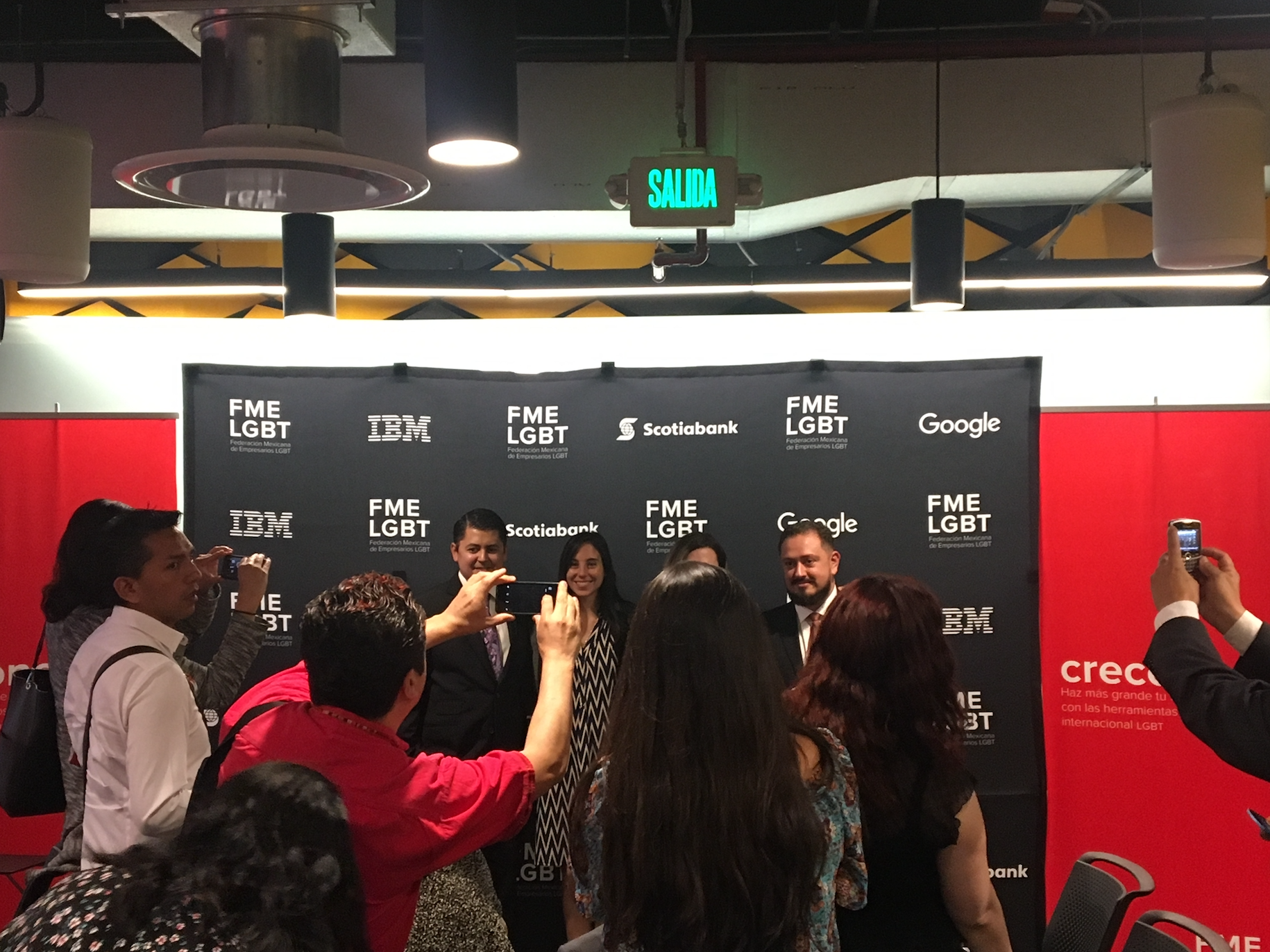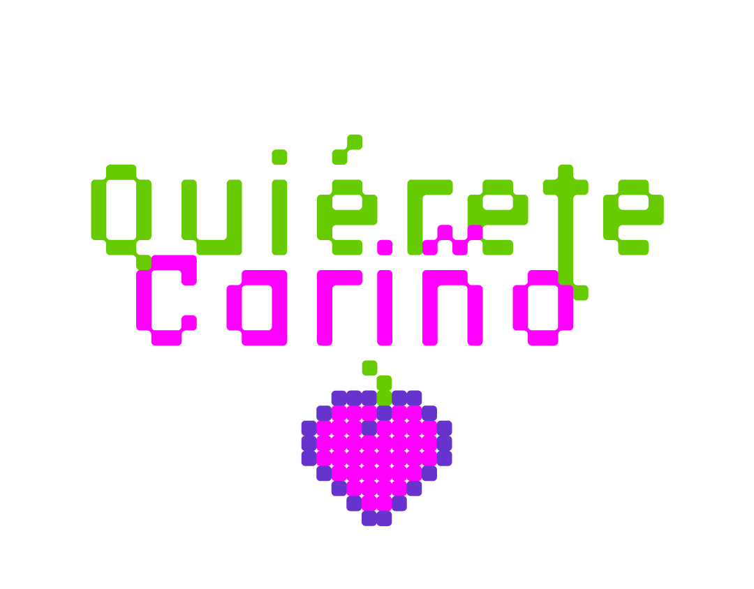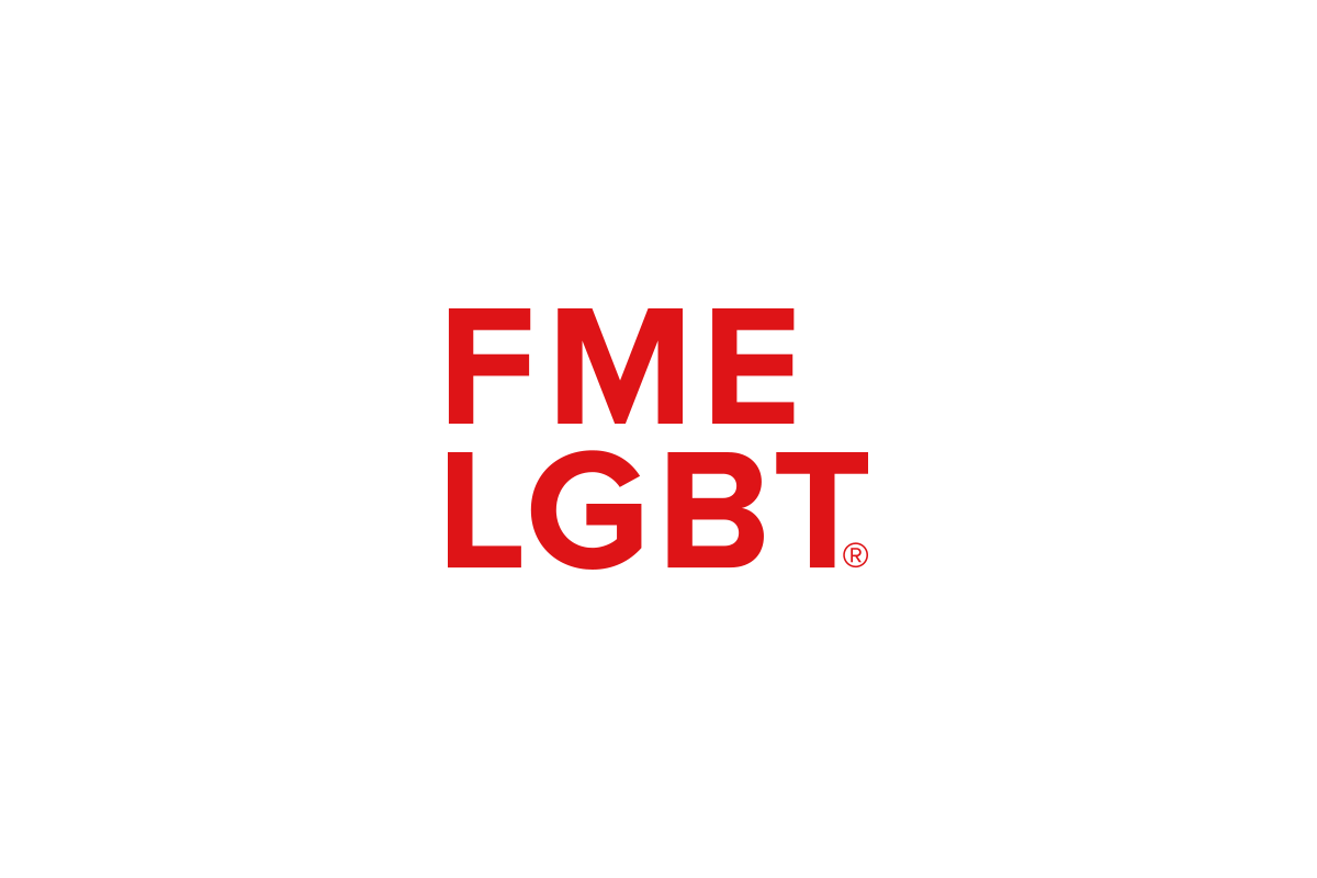
The Mexican Federation of LGBT Business Owners needed an identity that was as bold as the community it represented, but minimalistic enough to not overpower its affiliates' brands.
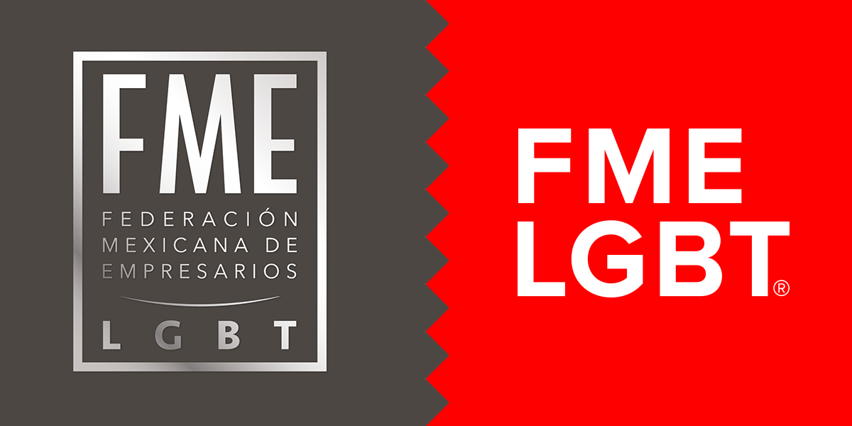
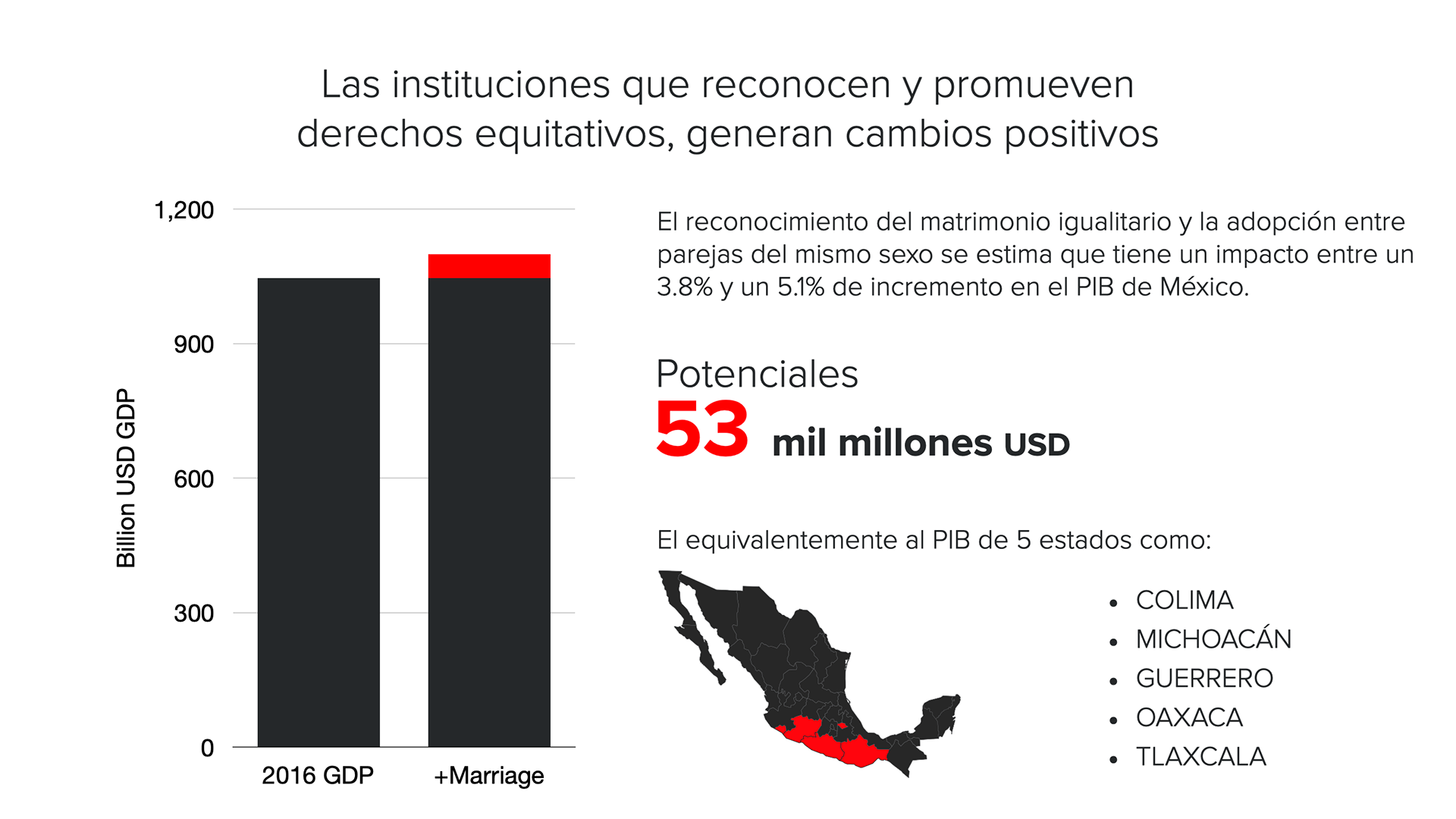
The new identity system was planned to play well with any others while standing out from the crowd, thought around simple visual cues, infographic data and readability.
Its new form, typography and color palette transformed its visual message to reflect the dynamic organization it is now, and let its members identify with its principles.