To celebrate its 10th year anniversary, the agency sought out to streamline and revamp its brand identity, without losing its origins and visual values.
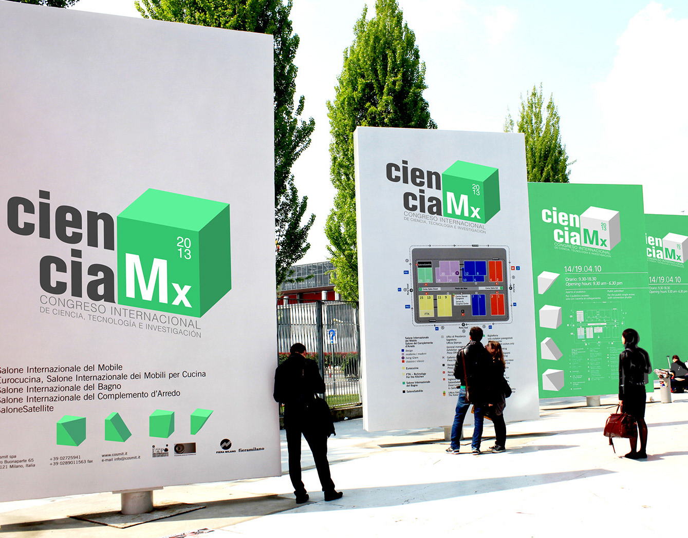
The identity that was used for a decade was inspired by the Rubik's cube shape and colors, but it had limitations regarding applications and color management.
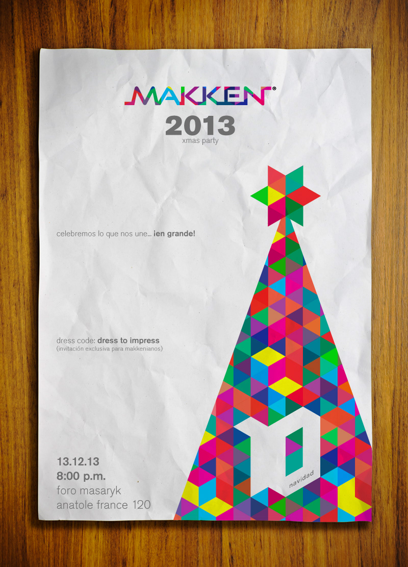
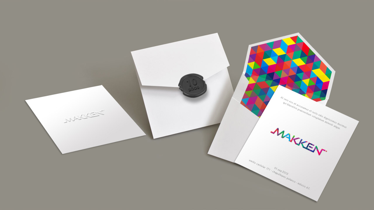
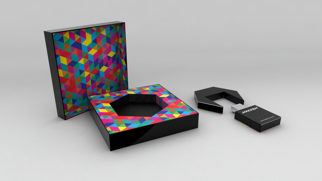
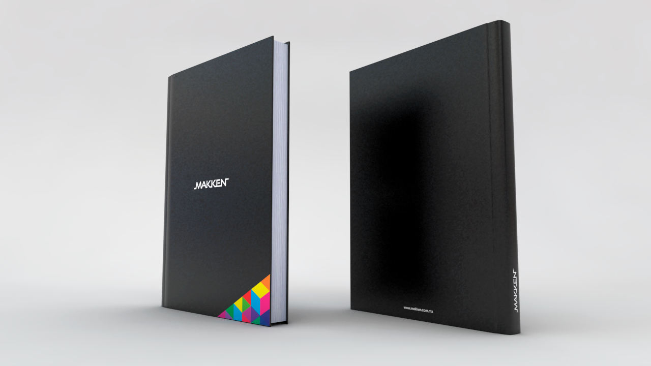
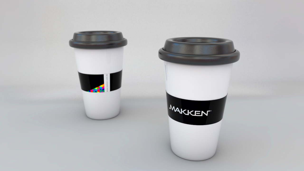
To relaunch the brand, the Rubik's cube was re-interpreted and made into an infinite plane of isometric shapes that generate random combinations of the RGB and CMY colors.
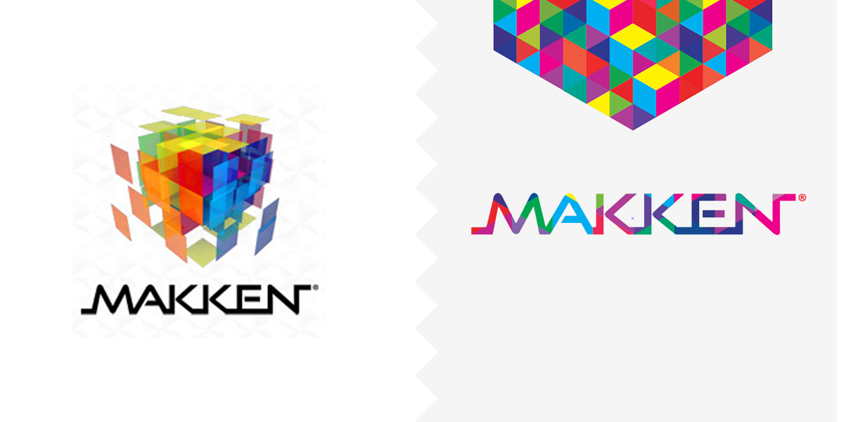
BEFORE / AFTER
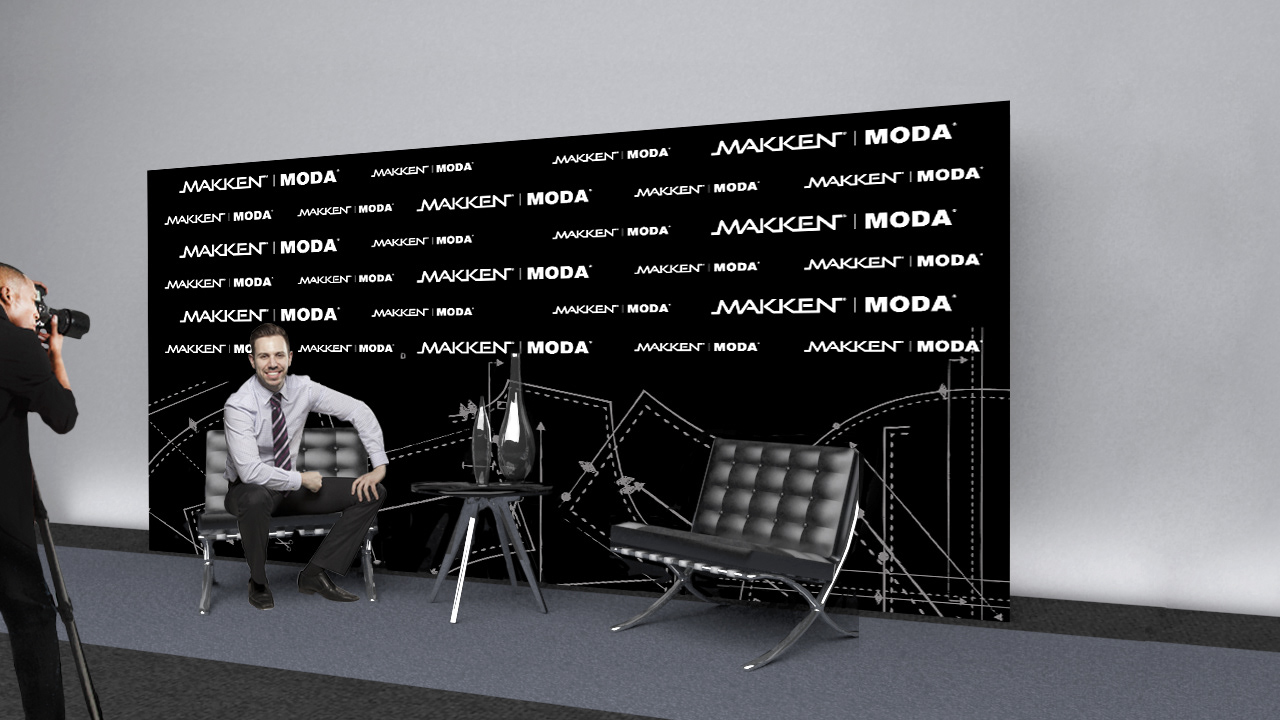
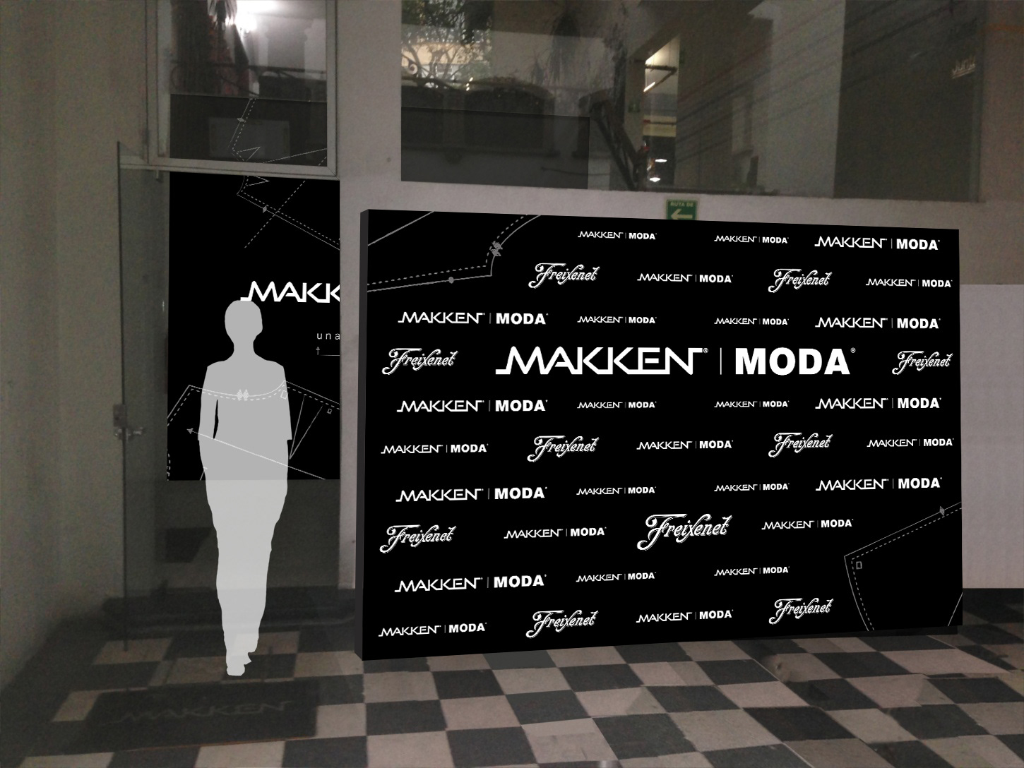
The company made sure its clients and employees got the good news by gifting promotional kits and placing the infinite plane on every application as possible. A few sub-brands were also developed.